
설명
Omnix Responsive Preview helps developers, designers, and site owners instantly preview their website in different screen sizes.
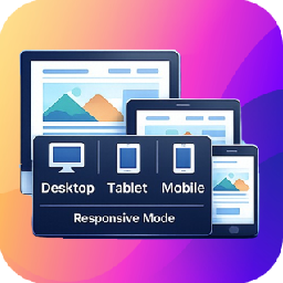
The plugin adds a lightweight popup panel on the frontend that allows you to toggle between Desktop, Tablet, and Mobile views. It’s perfect for testing responsive layouts during development or content editing — no browser dev tools required.
Key Features
- Toggle between Desktop, Tablet, and Mobile views
- Popup panel with clean and minimal UI
- Instant preview without page reload
- Works on any WordPress theme
- Lightweight and performance-friendly
Ideal for:
– WordPress theme developers
– Plugin developers
– Designers & QA testers
– Content editors checking responsiveness
Usage
- Open any page on the frontend.
- Click the floating Responsive Preview.
- Choose:
- Desktop
- Tablet
- Mobile
- The page will instantly resize to the selected viewport.
- Go to Settings > Responsive Preview from WordPress admin dashboard and change screen sizes for desktop, tablet and mobile devices.
No configuration required — it works out of the box.
License
This plugin is licensed under the GPL v2 or later.
스크린샷


설치
- Upload the plugin folder to
/wp-content/plugins/, or install it directly from the WordPress Plugin Directory. - Activate the plugin through the Plugins menu in WordPress.
FAQ
-
Does this plugin affect real visitors?
-
No. The panel is visible only to logged-in users (typically administrators).
-
Does it reload the page when switching views?
-
No. View switching happens instantly without reloading.
-
Will this plugin work with any theme?
-
Yes. It works with all properly coded WordPress themes.
-
Can I change breakpoint widths?
-
Yes. Breakpoint widths can be changed.
후기
이 플러그인에 대한 평가가 없습니다.
기여자 & 개발자

자국어로 “Omnix Responsive Preview”(을)를 번역하세요.
개발에 관심이 있으십니까?
변경이력
1.0.0
- Initial release
- Desktop, Tablet, and Mobile preview modes
- Frontend popup panel UI
- Screen size settings page